Interface, Branding
& code

Consultório

iD

" alt="">
Client

Fleury Group

Location

São Paulo

Work Description

Lead Product Designer

Consultório iD, initially released as Cuidar Digital during the COVID-19 pandemic in 2020, is a telemedicine tool developed by the Fleury Group for doctors. Launched to meet the urgent need for medical attention, it provides remote consultations and medical test results.

After analysis and implementing design techniques, we successfully increased the appointments per day, from 15 to 45 (+300%). We achieved this by adding critical features, improving the overall experience and giving the product a new modern look.

Overview

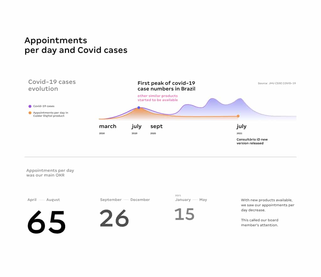
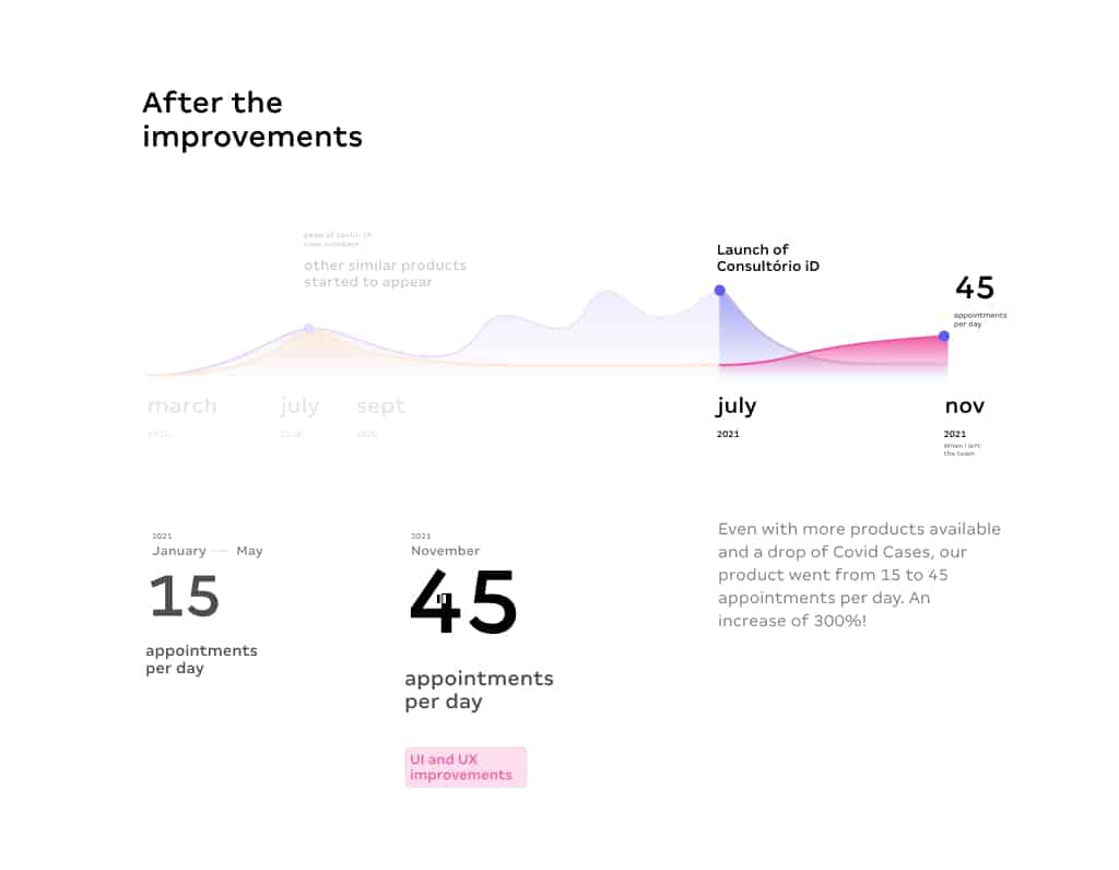
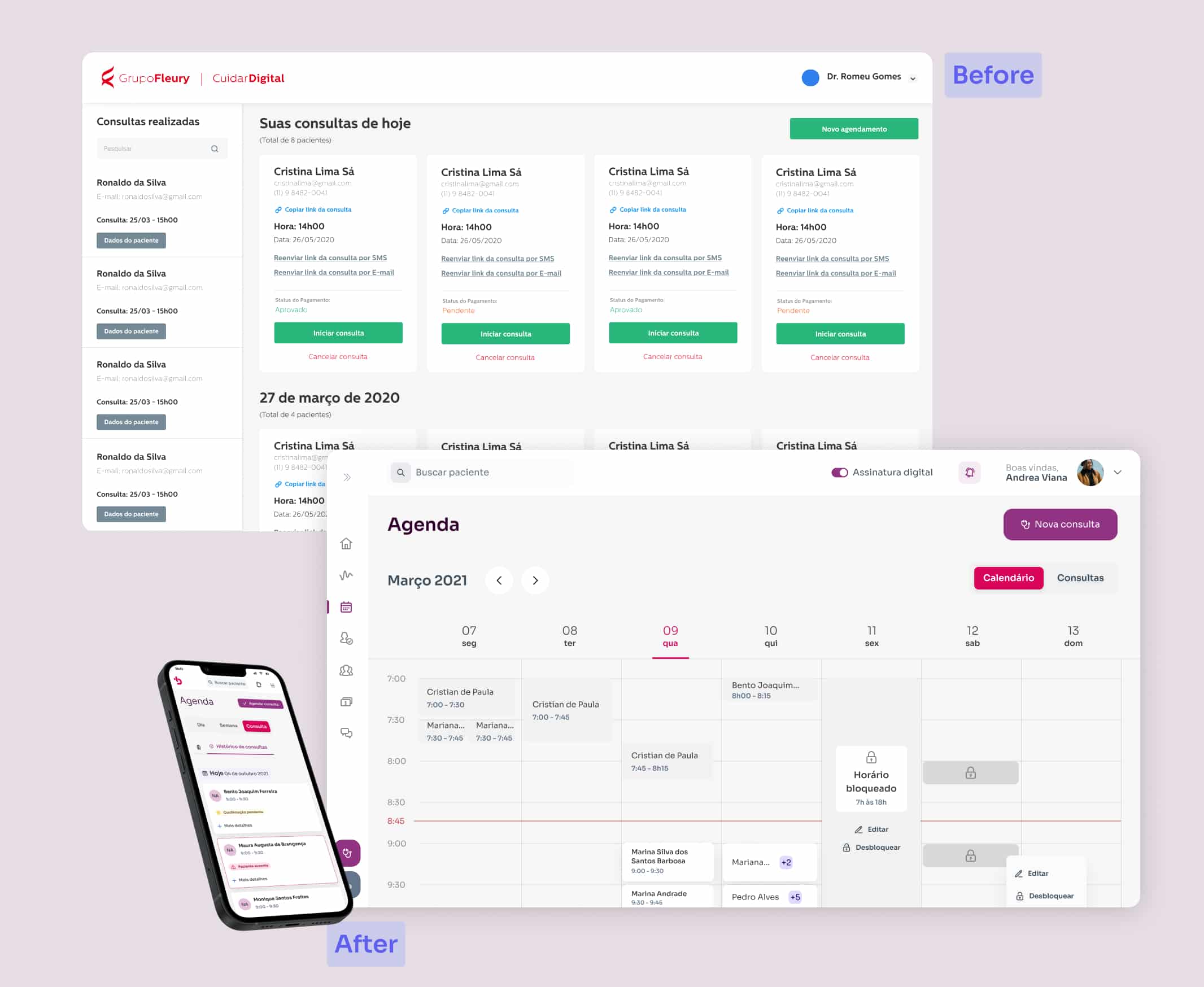
Initially, our product was a profitable tool, since the in-house integration with exams results led doctors to request tests from Fleury labs, which is the core business of Fleury Group.

However, as new tools began to emerge and our product did not evolve significantly with new features and usability improvements, we observed a slow decline in our main ORK, the number of appointments per day from 65 to 15 (average).

With this scenario, board's members asked to rebuild the whole product as a proof of concept.
This would help them to decide if they would keep investing on the product or shut it down.

My first big challenging task was redesign the whole product in 2 weeks.

This is definitely not the ideal scenario! But I've used this opportunity to improve several usability and visual aspects based only on design heuristics and UX good practices while working closely to the Product Manager.
After the product's approval, we started the development and now, with a little more time, we started to really apply a structured design process with research and testing.

Design Process

Given our tight deadlines and substantial workload with a small team, we needed to adapt quickly. In this situation, we had to make strategic decisions to extract the maximum value possible to achieve our business goals and regain our market share.

So this is how I structured my design process:

01. What are the business's need?

Design is all about the user, but a companies need to stay profitable in order to keep going. So the business goals was an aspect I always try to account and use it to guide some decisions.

In this project specifically we got 3 main goals for the year:

  • Appointments per day was still our main number. Goal was to increase to 50 per day.
  • Grow our users base in 25% targeting cities where there is a lab from Fleury Group, since it's a income source
  • Enable online payment so in the future we could make it a paid feature

02. Data gathering

We started gathering data from Google Analytics and Hotjar surveys. This helped us understand that while we still had many appointments created, only a few were actually completed (the 15 per day).

Gathering the available data was quick, demanded little effort and provided valuable insights.

Our main takeaways were:

  • Our telemedicine tool was a major setback
  • Significant mobile access, primarily from patients. And since our platform wasn't mobile friendly, this became a huge problem.
  • Missing features available in other market products
  • 4. New users’ retention was very low and usually didn't come back or got more engaged to the product.

03. User interviews

My process for interviews is based in the Human Centered Design. So my approach is:

1. Understanding the users' daily routine
I try to understand tasks they need to accomplish and how they complete them. This helps me identify how I can assist them thought the product.

2. Ask about specific issues about the product
This includes issues in their experience or any other challenges they would like us to resolve.


In this phase we identified more improvement points, which are:

1. Secretaries used the platform a lot more than the doctors: This made us craft some experiences for the real users. Also protected patients sensitive data

2. Doctors don't know how much money they make: This was a general complain. We took as an insight to help them to engage with the platform by creating the financial feature.

3. Patients don't attend because they forget their appointments: We didn't have a messaging system to remind patients of their appointments

4. Patients don't attend because it was difficult to join the virtual room: Patients had a hard time trying to find the email with the appointment link and join the virtual meeting because the flow was too long

5. Lack of a tutorial or instructions for the first use: When using the platform, all was just a white screen without much direction. This was a retention killer.

6. They usually keep track of the appointments schedule outside the platform: This was the biggest reason why the patients didn't engage with our product. They want a ”one-stop-shop” product to centralize everything

04. Ideate, test, iterate

We structured some insights gathered from our data analysis and user interviews. Those helped us embarked on a comprehensive redesign of our platform to address the identified pain points.

We divided the work in 2 main areas:

Solve usability issues

  • Mobile-first design: have a good experience on mobile too
  • Redesign the patient flow: we reduced the steps and friction for patients to join the virtual room
  • Improvements on test results: a better experience to access and view patients tests results
  • Appointments reminders for patients: remembering the appointments to reduce the no-show
  • Empty states and onboarding: provide guidance and increase the retention for new users

Engage and attract

  • Virtual and in-person appointments: provide tools to transform Consultório ID in a useful platform for both online and in-person assistances.
  • Financial control: feature to manage all payments and help them to keep track of their finances and incomes
  • Schedule management: calendar for all their appointments
  • Patients database: they now have access to all their patient's information
  • Landing page review: using data from research and Hotjar, we reorganized the landing page to be more attractive and improve our conversions.

Results

As a result of our efforts, we released the new Consultório ID in July 2021. Following the release, we observed a significant increase in average appointments per day, growing from 15 to 45 (+300%).

Despite no marketing efforts, we were able to increase our numbers and profitability through design and strategic thinking.

We typically noticed a correlation between the rise in COVID-19 cases and the number of daily appointments. However, after implementing our solution, we saw our numbers increase even as COVID-19 cases declined.

This is the final results of my team and I efforts

Next project

Weex

Let's get
in touch