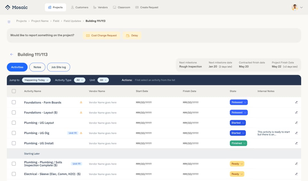
Interface, Branding
& code

Tile

Design System

" alt="">
Client

Mosaic

Location

Phoenix, AZ

Work Description

Development of a Comprehensive Design System for Mosaic Hub

Mosaic is a fast-paced construction startup that iterates its products quickly. With new projects constantly entering the pipeline, product development struggled to keep up and the lack of a cohesive Design System was one of the reasons.

Preparing for upcoming projects, Mosaic needed a robust Design System to facilitate rebranding and ensure a seamless user experience and scalability. A Design System was essential to scale iterations and launch the MVP effectively.

Development Process

Although each situation sometimes requires different strategies, the development process for Tile generally followed these key steps. This structured approach allowed us to adapt to specific needs while maintaining a consistent methodology across the project.

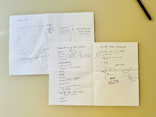
1. Audit and Planning

  • Conducted a detailed audit to identify essential components involving design, product and engineering teams.
  • The result of this phase was a list with all components would be created and coded.

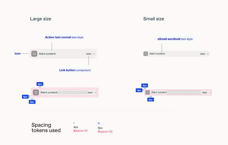
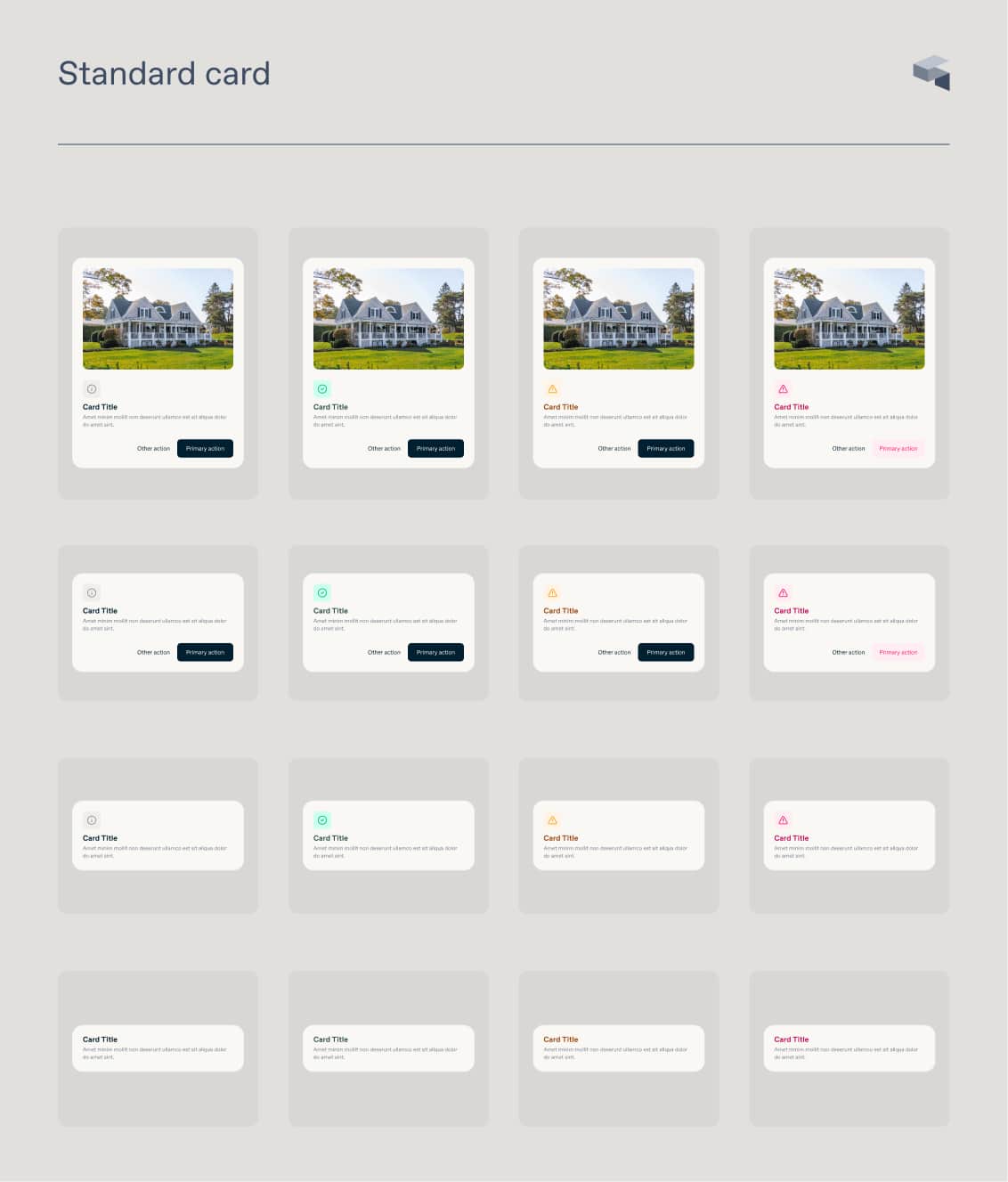
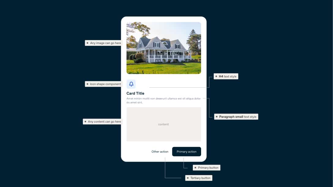
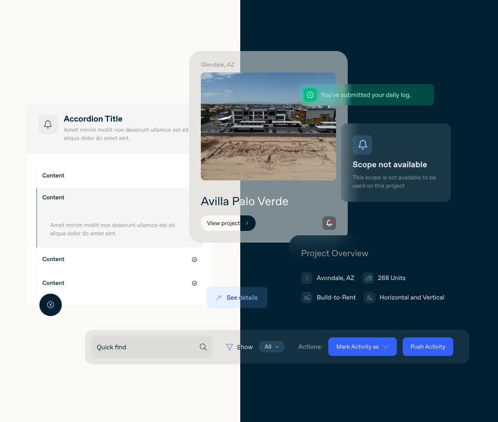
2. Component Design and testing

  • Designed components with scalability and reusability in mind following the list from the previous step.
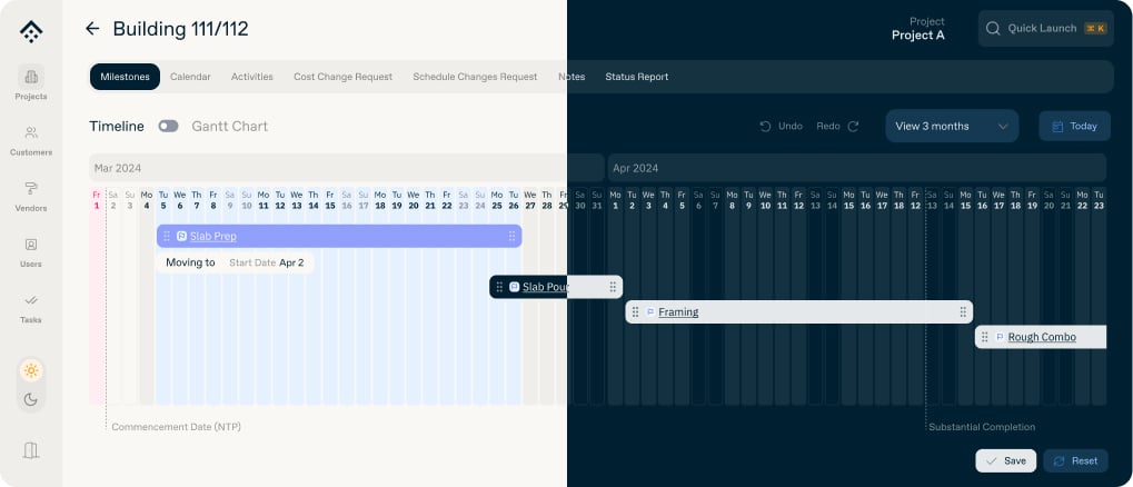
  • Testing the components in Figma with real data by mimicking real pages with real content helped to create components and patterns that would deliver the best experience.

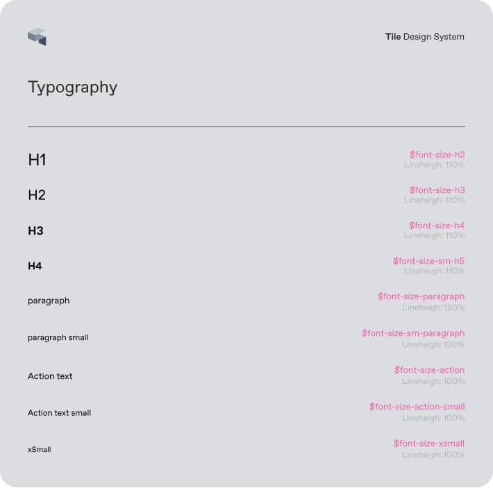
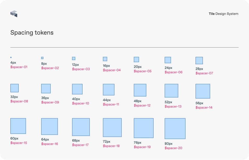
3. Documentation and code

  • Created detailed documentation and usage guidelines to support designers and developers within the product.
  • We had a dedicated page called Tile Design System, accessible only to the design and engineering team. This page contained comprehensive documentation for all components, including guidelines and application examples..

To assist engineers and ensure pixel-perfect components, I contributed also coding and styling most of the components using the library shad.cn/ui and Tailwind CSS.

Strategic research

Working within a small team and tight schedule, the Design System needed to expand rapidly requiring a strategic approach to continuously reimagine and grow the library.

Collaborating with Product, Engineers, and my manager, we conducted a thorough audit to compile a comprehensive list of components, addressing both basic elements and complex patterns. This evaluation was crucial to identify necessary components and avoid designing and coding elements that wouldn’t be utilized.

Additionally, designing with real data was pivotal. While generic text was used during the low-fidelity phase, finalizing components and screens involved inserting real data values to anticipate and address potential roadblocks, such as:

  • How would it work with a really long title on this card?
  • What if I need rich content with actions and other components instead of plain text inside this popover component?
  • What if I have numerous filters and actions in the action bar?

Mapping the cases and testing with real data and page contents were fundamental for designing better experiences and more powerful, flexible components.

Setting the foundation

One major point we had to address was the lack of brand personality in the products since we're using a Google Material design kit. To tackle this, I created a color palette using the brand colors as the base and added strong, creative colors for the feedback elements we needed.

Initially, we established all tokens for spacing, breakpoints, colors, and typography. During one of our iterations, we transitioned our project stack to Next.js and Tailwind CSS. We then adopted Tailwind's spacing tokens and breakpoints while retaining our custom typography sizes and typeface and brand colors.

Additionally, we developed a flexible solution that incorporates modern effects such as blur and transparency. This also laid the foundation for the dark mode we introduced later.

Using rules creatively

My approach to working on Design Systems balances following established standards with the flexibility to break them when necessary for creativity. This means adhering to set guidelines but also being open to creating new solutions for complex problems.

Collaboration with product managers and engineers ensures that changes, such as introducing new components or modifying existing ones, enhance the system without adding complexity. By fostering open communication and a flexible mindset, we can innovate while maintaining consistency and effectiveness.

One small example is the introduction of a new custom card specifically designed for projects, which we created as ProjectCard. This card is engineered to highlight key information in a manner that ensures critical details are easily accessible to the user.

Outcome

As a designer who can also code, I could bridge the gap between design and engineering, streamline the process, and ensure visual quality with a polished look.

As a result, the engineering team can quickly build interfaces using our components. If any updates are necessary, I can make the changes myself, and every screen will be updated.

We designed and coded over 40 components, page templates, and patterns that were successfully reused to build our pages quickly and efficiently.

Key achievements

  • Championed the design and implementation of the Tile Design System, enhancing engineering efficiency by 45%
  • Worked on a major redesign and creation of a style guide for construction documents, improving consistency by 70% and strengthening the company's brand recognition.
  • Collaborated closely with the Design Manager to quickly iterate and adapt features in Mosaic Hub.
  • Excelled in a fast-paced environment, driving continuous improvement.
  • Explored AI integrations for Mosaic Hub, designing experiences for chatbots, an AI Assistant, and participating in an AI hackathon.

Next project

Consultório ID

Let's get
in touch